
Monaspace - Microsoft presents a new font family for code
The way they talk about it makes it sound like they invented the written word, but that notwithstanding the fonts actually look really nice in my opinion.
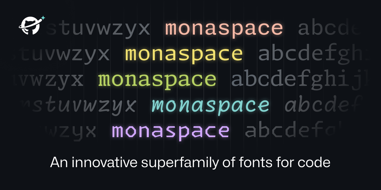 https://monaspace.githubnext.com/Open linkView original on lemmy.ml
509
Comments117
People actually change fonts in their IDE? I've always used whatever the default is and never even thought about it.
Try Fira Code font
I'm a big fan of Fira Code! I haven't found any others I like more.
Love Fira Code but recently switched to https://typeof.net/Iosevka/ and it’s equally great.
You just made my day. Thank you.
I actually have. I didn't install it in an IDE, though. This font comes with popOS
I always do. I'm a fan of JetBrains Mono.
It is the default font. At least in all the JetBrains IDE
What makes this unique is that they're saying this allows for different fonts in the same piece of code. So you could have comments in one font, your code in another, AI written code in another, etc. Looks like all the fonts are the same size, so everything still aligns nicely.
I'm an Envy Code R fan myself.
some people even change default system fonts used in the deskop environment (menu's, filemanager etc) 😎😁
Damn, I need to get out more.
I've always preferred IBM's Plex Mono, specifically the Nerd Fonts version.
Calling it now, Radon will become the new Comic Sans.
Honestly I could see radon for comments only. It makes it clear that it's a comment by the font alone.
I can too. I’ve seen something like that before. It was interesting, but not interesting enough for me to care about it as a feature.
Except I like reading the comments…
I mean, Comic Code is pretty damn good.
I can't believe how no one seems to have mentioned how beautifully made this website is though. Absolute pleasure to scroll through on mobile.
That was interesting how they adjusted sizes based on adjacent letters. Good idea
Great idea but the name texture healing is terrible. It’s not healing anything and there are no textures with fonts. Dynamic or flexible weight makes a lot more sense.
I agree that texture healing is a bit too vague about that they’re really using it for. Its really for kerning pair without disrupting the monospaced grid. Maybe, since the audience for these fonts aren’t usually typographers, they should have called it Monospaced Kerning Pairs?
Texture is a term and feature of typefaces in design however. Usually described for fonts used in body text, or larger blocks of text.
While it probably doesn’t affect shorter lines of text used in most coding languages, it can be harder to read when smaller sizes are used. Monospaced MmWw are the worst culprits.
—Source
Ironically the second paragraph is turning out to be largely incorrect with smarter ways to analyze blocks of typeface texture. Also this second paragraph nicely illustrates the utter wankery present in a lot of typography circles and analysis.
Gotta justify that grad school bill somehow (pun intended).
Edited for spelling
Oh interesting! In that vain, it does make sense. Thanks for taking the time to explain that.
Getting major Marvin Gaye vibes.
When I get to squinting, I want... textural healing
Like kerning pairs, but with character swapping instead of kerning adjustments. It’s a really clever use of the language features available in Unicode.
Too bad I'm married to JetBrains Mono.
Don't think it does.
Could elaborate on what the "dynamic width thing" means?
Like how Neo flexes in the hallway and the entire Matrix flexes around him, except with wide letters like 'm'.
Letters like m and I are still same pixel width, you just use function of openfonts to shift letters and replace with wider version where possible.
#[ i ][ w ]
Becomes
#[ i ][\/\/]
I like Hack as my font of choice, but I will probably give this a shot. It's a font, there is no risk of data collection, Microsoft style bugs, or other Microsoft-associated product issues.
TeamViewer checks for a font their app installs when visiting their website to fingerprint you.
https://www.ctrl.blog/entry/teamviewer-font-privacy.html
In my web browser I personally use uBlock Origin to just block all remote fonts and browse with a JS disabled by default policy. It's an annoying but necessary compromise, in my opinion.
Also, in Firefox v118 a new feature was introduced to curtail the font fingerprint route as well: "The visibility of fonts to websites has been restricted to system fonts and language pack fonts to mitigate font fingerprinting in Private Browsing windows."
I'm sure you know this, but for anyone else scrolling through the comments it is actually ridiculous how much data websites can query and receive to fingerprint users from the web browser. Just look at https://amiunique.org -- "WHY IS THIS ALLOWED?" is the question I have asked for many years now.
Because people want to have features in their web browsers and originally no one really designed the web with security in mind.
Some of it is incredibly difficult to imagine how to do in a private way, too.
For example, my browser can display AVIF images. If my browser announces in the Accept "hey, I'm able to display AVIF images. Please send me AVIF images if you have them rather than JPEG", that helps to identify me, since most browser don't display AVIF, which sucks. But I really want to get AVIF images: they're efficient. So how do I announce that I want AVIF images without announcing that I want AVIF images?
Some of the other web features were well-intentioned but have just ended up being useless. Like your browser also announces what language you prefer. Like "hey if you a German version of this text, please send it to me in German, thanks". But for some reason EVERY WEBSITE IGNORES THIS and just says "oh you speak Spanish and English but you're travelling in Russian right now? HOPE YOU LIKE READING RUSSIAN FUCKER". So it's 100% only used for invading privacy now.
Some of the tracking mechanisms never should have been allowed in the first place (like timezone and which fonts I have installed), but some of them (like Accept) I can't think of how to do in a secure way.
Fuck me sideways.
Also, I'd remove battery charge metric from the fingerprint. Since it changes over time, I wouldn't really consider it a good or even usable metric.
Could be used in combination with other metrics to identify a specific user's movements through a site over time, if the other metrics aren't unique enough.
Possibly, but when you have time as a realiable metric already, you dont need another metric that ticks down at an unknown and inconsistent speed, and goes up once in a while. Hell, I keep my laptop plugged 99% of the time.
I used Dejavu Sans for like 10 years, and Hack is the perfect incremental improvement. I've tried to use other fonts but I keep coming back to Hack.
https://security.stackexchange.com/questions/91347/how-can-a-font-be-used-for-privilege-escalation
Not a serious rebuttal. But yes, MS has found a way for Windows to be vulnerable to attacks using fonts.
What the....
I meant to link the CVE sorry. https://cve.mitre.org/cgi-bin/cvename.cgi?name=CVE-2011-3402
I'd never bother changing whatever default font the editor comes with and I don't understand why anyone would care to
Some people care more about having fancy tools than actually doing work with them.
On reddit, I used to subscribe to the VS Code subreddit. A lot of posts were just about themes, people asking "what theme is this" or posting their latest minor recolor. Meanwhile, I'm there for posts about actually using the damn thing.
sorry i already have comic shanns for that
https://github.com/jesusmgg/comic-shanns-mono
Thanks I hate it
I've used a similar comic-mono font for a while and it was really good! I don't like how lots of mono typefaces are angular or sharp.
That doesn't look half bad, actually!
i use it in visual studio code and it looks really nice!
Looks lovely! The art of fonts is something I will never understand but always appreciate. This website is also brilliant in showing everything dynamically and explaining why it all matters. Safe to say Github will start using it everywhere? It's also open source, which is nice (and makes sense considering what Github is striving for).
Edit: Not 100% sure on texture healing though. Toggling it on and off in the example makes me feel like texture healing makes everything look weirder. It makes the font look less monospace which should be good, but it just messes with my mind when some letters look slightly different in different contexts. Like the spacing is not immediately obvious to me and having the same letters look different is throwing my mind in a loop. I guess I'll need to try it to see if it's comfortable.
Very interesting technique to get the widths of the glyphs uniform without them looking ugly in most cases. OK, one can make it look bad if you know the "pain points" of the system, but in normal flowing texts, the fonts do look good.
https://www.programmingfonts.org/#hack
You can check out fonts here and filter based on mono spacing, ligatures, etc. Hack is by far my favorite font but I just wish I could use it with nerdfont/jetbrains ligatures. It just has this beautiful way of being able to look open and readable while taking up less space than fonts like fira or jetbrains.
Cool for them for making a font, but personally don't think it's up to firacode, hack, jetbrains or many other fonts out there
Wait, why did they invent the phrase "texture healing" for literally what all mono space fonts try to do: make a monospace font that doesn't look like cluttered shit.
They explain it as the same way cursive fonts can have variations on the letters so that they match up (the loop of the y into the e for example). I think it works by having various versions of each glyph: normal, wider to the left, wider to the right, etc) and then pick the glyph based on the surrounding ones.
Pretty cool actually, though I highly doubt this is an innovation. Good for them if they’re actually the first font to do this
Because otherwise they couldn't justify their continued work on things nobody asked for.
Also, those letter combinations are called ligatures, and are generally a bad idea in monospace fonts. The point of them is to make it very clear where one character ends and the next one begins.
Not sure if you misspoke or are just unaware of it, but Hack is one of the prepatched nerd fonts: https://github.com/ryanoasis/nerd-fonts/tree/master/patched-fonts/Hack. Also, for any fonts that aren't prepatched, there's a patcher in that repo to make any font a nerd font.
oh wait you're right. I wasn't having luck with the nerd fonts on windows but on linux it was somewhat better. what I was thinking about was having Hack with nerd fonts and Jetbrains ligatures patched in. I found a couple repos that purported to do that except the ligatures never worked.
Such a subjective thing and often heavily based on familiarity, but looking at that solidifies my appreciation for Ubuntu Mono
That’s a nice one!
This is the one I use.
Having different font styles depending on the context is a really nice feature. I'll definitely give it a try.
It's a cool idea and the example they gave actually seemed pretty neat.
I'd (somewhat perversely) love to see this feature tried in a terminal emulator. ANSI does actually define escape codes for switching to alternative fonts (ESC [ 10 m through ESC [ 19 m) though I don't know of any software or even term drawing library that uses it.
That would really be neat.
A lot of code editors support that without the weird "healing" features they laid out here.
VSCode has pretty decent semantic based formatting options.
That Krypton font do looking nice
Yeah, like, since when does Microsoft put out something both functional and cool, ya know?
Well, their previous fonts are nice, Calibri etc
I didn't think I had strong opinions on fonts.
Turns out I viscerally despise "handwriting" fonts. They're harder to read. It just makes me recoil.
I also intensely dislike "ligatures " that turn like
==into a separate glyph. Or the one that turns>=into the > with the line under it. No. Stop. That's not what I typed. That's not what I'm looking for when I scan the text.Side note: I assume someone is feeling clever and is thinking of replying with a handwriting font message with ligatures. You don't have to. I already imagined it.
The texture healing seems cool though, but I didn't immediately notice or understand until I read through the detailed section on it.
I personally like ligatures when I'm programming. It took me some getting used to, but now I can't live without them due to how distinct it makes the code segments. I fully understand disliking them though. Thankfully fonts like source code pro allow disabling features like ligatures and their godawful handwriting styled italics, so you're able to use just the parts you like.
I'm a simple man, I just use DejaVu Sans Mono without any ligatures or other fancy stuff.
Works everywhere.
At least 1Il & 0O are different and (mostly) easily distinguishable in all the variants. Only exception is in the Argon variant 1 and l are too similar IMO.
This "texture healing" seems to be based on commit mono's smart kerning https://commitmono.com/ although it only shifts letters around, it doesn't change the characters.
Will they replace Consolas in Windows with this one or is it a GitHub-only-thing? In Consolas the characters
1andllook very similar, making the font unsuitable for coding and terminal use, so it would be good if they replaced it with something else.Anyone who makes a font where
Iland|are not immediately distinguishable should be barred from working in the industry.I hate Arial as much as a person could possibly hate a font for this exact reason.
Unfortunately this new font family still struggles with the l1 issue,in all but the last two typefaces. There's a lot of good ideas here, and the Krypton version isn't too bad, but I still struggle to see why they haven't figured out that gaping issue on most of the styles here.
I want to make a joke about how terrible the name is with just throwing in an 'a', but I don't think it would be right since I'm using Fira Code.
The texture healing technique is technically brilliant, but imho looks weird.
I will stick to Source Code Pro.
So I agree with OP on the style of the press release being infuriating.
It seems like a lot of tech releases these days are written for non technical journalists (ie The Verge), "tech influencers", and cargo cultists. They always read in a way that's super overhyped to the point where you almost want to be dismissive of the end product as a form of protests.
However the tech seems cool. Between VSCode and GitHub we'll be seeing a lot of feedback sooner or later.
I use Comic Mono and love it. Code is 100% easier on the eyes and to read.
cool. i will still use fira code, but it may be a nicer default alternative to courier new
I mean, they look nice, but I don't dislike whatever the default font that I use is, and I'm definitely not going to go out of my way to change a font. As long as it's legible, I don't really give two shits what the font is.
Cascading Code failed to impress me, although I'll give this one a try, I doubt it's better than Consolas.
This is brilliant. Definitely going to try this tomorrow.
Seems neat, I do love Sauce Code Pro though.
Love Neon. Very easy to read.
Iosevka offers too much customization to leave it—especially removing ligature abuse.
I personally use JetBrainsMono, it's my favourite. What do you guys think?
I love that one. I'm currently using Google sans mono which is great as well.
I also like working with that font.
Looks nice! Is this going to become the default font in GitHub and VSCode?
This seems neat, too bad it requires IDE support. Hope JetBrains IDEs support it soon.
No support for this yet in VSCode it seems.
Ironic. It's as if Microsoft departments aren't even aware of each other.
Fonts are an OS thing. If you don't have support for it, that's because you haven't downloaded it yet.
I was talking about this...
https://github.com/githubnext/monaspace/issues/6
cool. ive wanted a monospaced times-alike like their Xenon here.
Would this work in vs code only?
Even the textual healing? That seems to require a dynamic process that analyses the text, no?
Or are fonts capable of that?
basically fonts were already capable of using alternate versions of characters based on their nearby characters, so they used that for these fonts to allow for seemingly-dynamic sizing/spacing
I was actually gonna ask about this point, thanks for the context.
Open type fonts have these capabilities built in. It's up to the designer to implement it in useful ways like this.
It’s in the article:
Do modern IDEs allow for setting different fonts for comments, human written code, Copilot written code, etc? I don't do much actual coding these days, so it's been a while. I'm used to just seeing different colors but for things like comments and reserved words, but not fonts like they showed in the examples.
More fonts is nice, I'll give it a try
I'm all about MonoLisa, but I'll give this a look
i don't see ligatures in apps i use, like notepad++, Windows Terminal, Notepad and Notepads, also shame it doesn't support powerline features
Looks really good, but I'll stick with my favourite M+ Code, which I use in iTerm2, Emacs, and VSCode.
https://www.programmingfonts.org/#mplus
Also in https://www.nerdfonts.com/
Edited to add: they have semiwide and wide, but no condensed? Weird. That contextual resizing is pretty cool though!
I do not like the “C” in that font.
Another one? Why didn’t they contribute fixes to an existing font family? 🙄
Neon looks good. The rest are awful.
Terminus is still my favorite monospaced font followed by Roboto Mono, so ignore me.
Great, now whenever I want to talk to someone about Mona Font, they're going to get confused.
One superfamily.
Five fonts.
And my three variable axes.
I like the Go fonts better, but having more fonts that make monospaced text look good is a nice thing.
I can't shake this feeling that these are lacking something, like I remember looking at Fira for the first time and being like wow, even jetbrains mono had a sort of generic charm. These on the other hand, are just meh.
Maybe they are someone's cup of tea though. I am sure in 6 months I will be hearing about how GitHub invented the developer font of some rubbish like that.
This is pretty cool. But I'll stick with Anonymous pro.
Did you read it?