

The thing that wouldn’t die: why Gothic endures in visual culture [typographic case studies for Florence + The Machine, Wuthering Heights, Nosferatu, and more further down in the article]
![The thing that wouldn’t die: why Gothic endures in visual culture [typographic case studies for Florence + The Machine, Wuthering Heights, Nosferatu, and more further down in the article]](https://lemmy.world/pictrs/image/0ea78a4f-ca27-4b75-bf00-bcb400b5d7e5.jpeg) https://www.itsnicethat.com/features/gothic-resurrection-the-thing-that-wouldnt-die-graphic-design-illustration-271025Open linkView original on lemmy.world
https://www.itsnicethat.com/features/gothic-resurrection-the-thing-that-wouldnt-die-graphic-design-illustration-271025Open linkView original on lemmy.world10 Graphic Design Trends of 2026
I know listicles can often be cringy junk, but I thought this one actually did a good job of providing lots of different examples and breaking down the components of each trend they identified. Felt decently in-depth for a round-up; worth browsing for inspiration.
 https://www.vistaprint.com/hub/graphic-design-trendsOpen linkView original on lemmy.world


Peer into the mind of a type designer : The making of Peasy - A case study
An article by Peter Cho
This month I launched my first typeface, hopefully the first of many. It’s called Peasy, and it’s a low-contrast humanist sans type family that works well for setting long-form text. Peasy was my thesis project from my type program, and to be honest, the name came first.
The project started with a few original inspirations — one was making something “easy” — clean, easy-going, a font I would want to use myself. Another was the idea of modular, multi-color type. Here I explored ideas for stencil and multiple stroke inline styles.
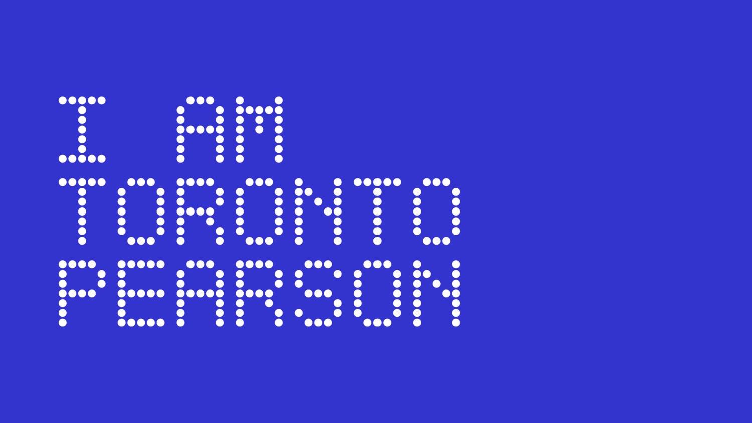
New Logo and Identity for Toronto Pearson Airport by Emblem
Official announcement : https://www.iamtorontopearson.com/news-and-events/check-out-the-new-i-am-toronto-pearson
Project page : https://www.madebyemblem.com/project/toronto-pearson
"IATP Hype Video" (their own words) : https://www.youtube.com/watch?v=tvj6aS3UPPE
Toronto Pearson Airport is Canada’s biggest and most heavily used airport accounting for 60% of the country’s international arrivals. A pillar of Pearson’s strategy coming out of the pandemic is employee acquisition and retention. “I AM TORONTO PEARSON” (IATP) is a brand developed by Pearson in 2016 to serve the community of over 50,000 employees and required a refresh to facilitate their new plans in growing and celebrating that community.
We took inspiration from athletic brand advertising and promotions in professional sports to evoke a sense of heroism, camaraderie, and energy into the IATP look and feel. Through its photographic style and taglines, IATP celebrates its community and the jobs that they do. We created a custom typeface based on Pearson’s departure gate signage — a subtle reference to the traveler being the end focus of IATP.
 https://www.iamtorontopearson.com/news-and-events/check-out-the-new-i-am-toronto-pearsonOpen linkView original on jlai.lu
Brown Branding Mockup Series: A Designer's Dream Come True
This is an article (a disguised ad?) from Abduzeedo with pictures showcasing this mockup bundle, but the actual website where you can check it out is this one, I'm mostly sharing because they look high quality for a reasonable price : https://showcasebh.com/
The Brown Branding Mockup Series is an array of elegantly crafted mockups that showcase various objects including paper bags, boxes, envelopes, letterhead, and business cards. These items are integral to building and representing a brand's identity, and what better way to present them than with highly realistic and customizable mockups?
- Versatility: The series caters to a broad spectrum of design needs, be it branding for a start-up or rebranding for an established organization. The different objects provided allow for a complete and cohesive presentation.
- Quality: Created by Showcase Mockups, the team behind renowned design resources, the quality is impeccable. Every detail, texture, and shadow has been meticulously crafted to produce a lifelike replica of the real thing.
- Ease of Use: Even though I have two decades of experience, I appreciate tools that simplify my workflow. These mockups are easy to work with and allow for quick adjustments, making them suitable for designers at any stage of their career.
New Logo and Identity for AllTrails by Red Antler
From wikipedia :
>AllTrails (www.alltrails.com) is a fitness and travel mobile app used in outdoor recreational activities. This app is commonly used for outdoor activities such as hiking, mountain biking, climbing and snow sports. The service allows users to access a database of trail maps, which includes crowdsourced reviews and images. Depending on a user's subscription status, these resources can be used online and offline.
Project page : https://www.redantler.com/work/alltrails
>The outside is in all of us, but the outdoorsy world of hiking boots and mountain peaks can be intimidating. As an app built and curated by the community, AllTrails helps people plan, live, and share their next outdoor adventure — whether that’s a hike up a mountain or a stroll around the neighborhood. Our brand system leverages a path framing outside stories big and small along with inclusive imagery to awaken the outside people in all of us.
 https://www.redantler.com/work/alltrailsOpen linkView original on jlai.lu